KHYOÙT

KHYOUT
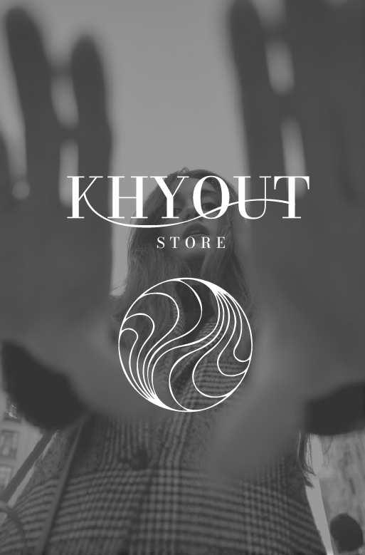
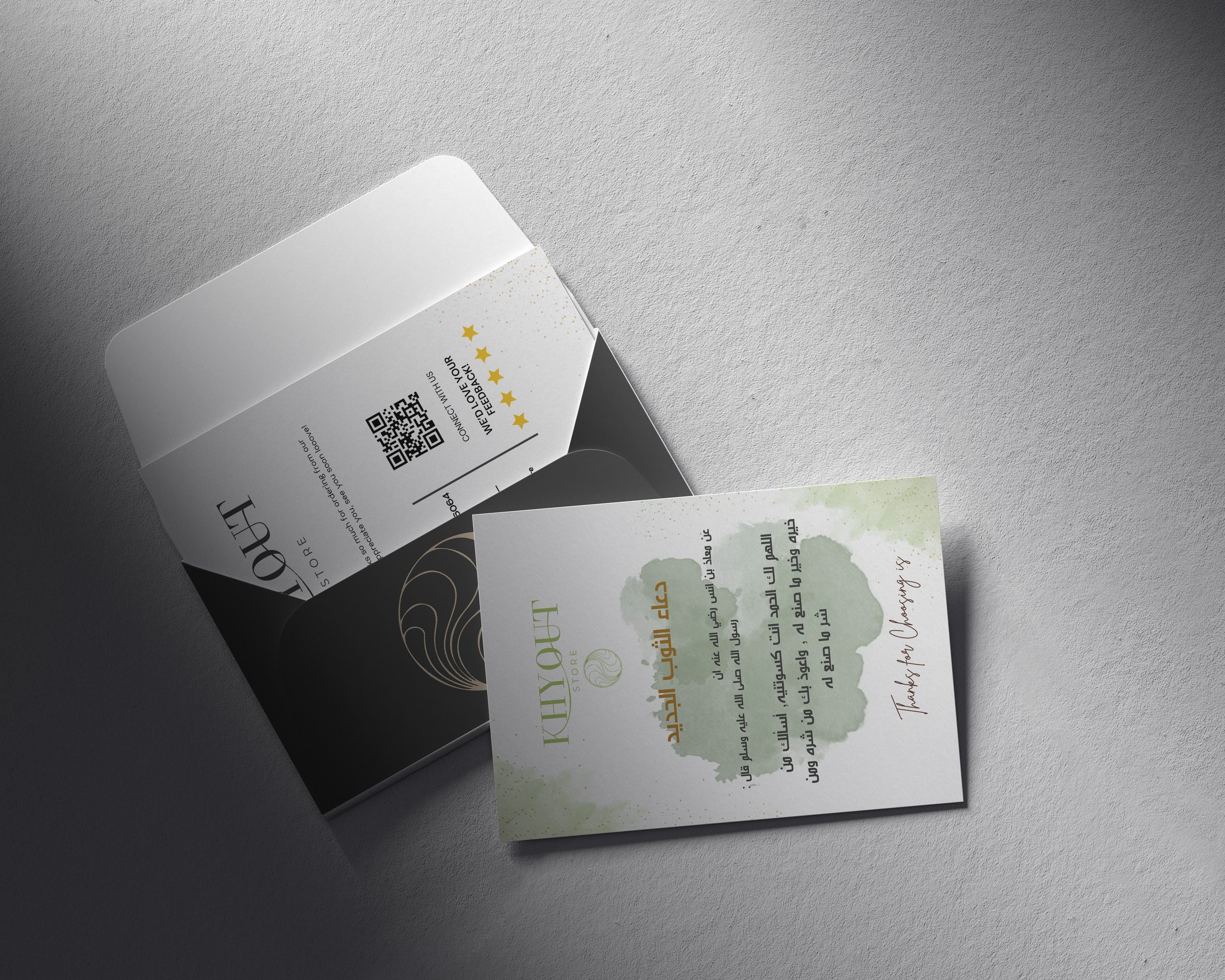
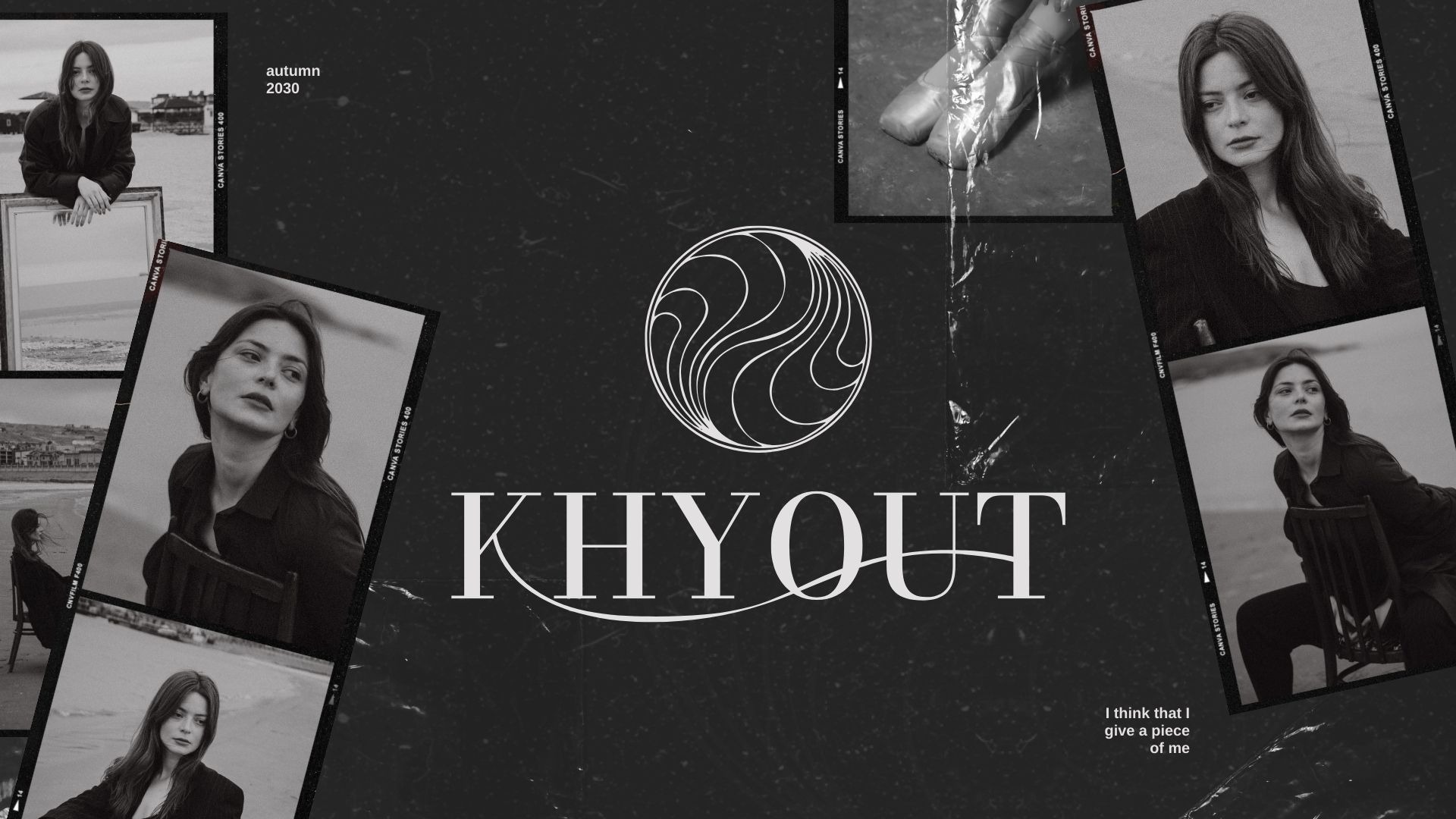
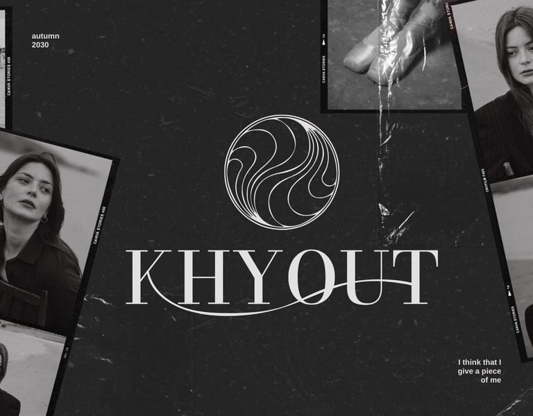
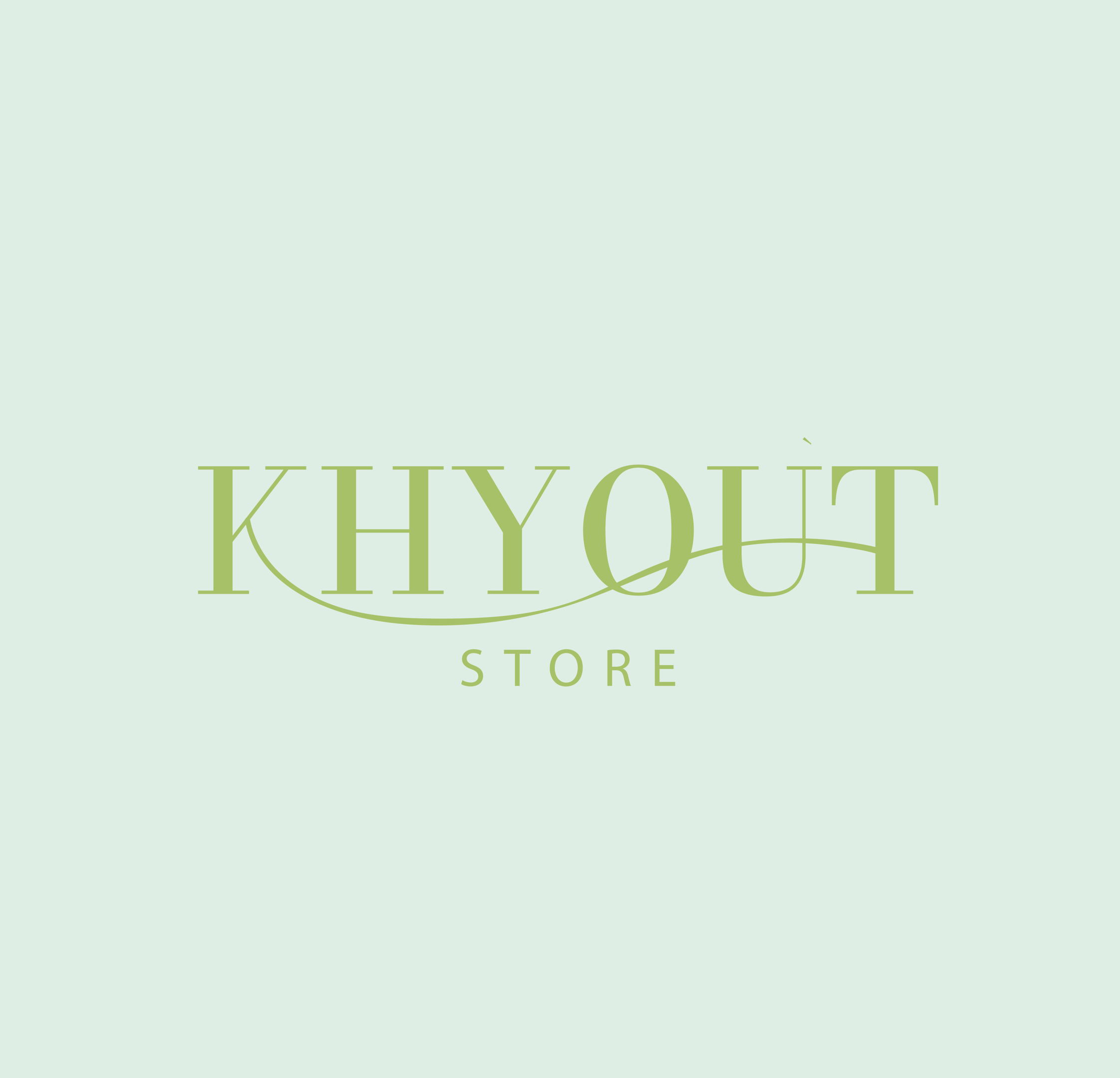
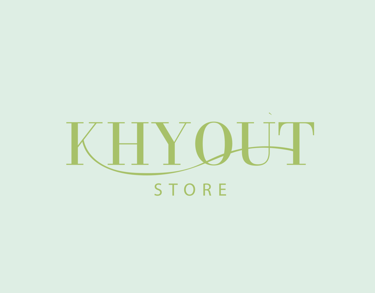
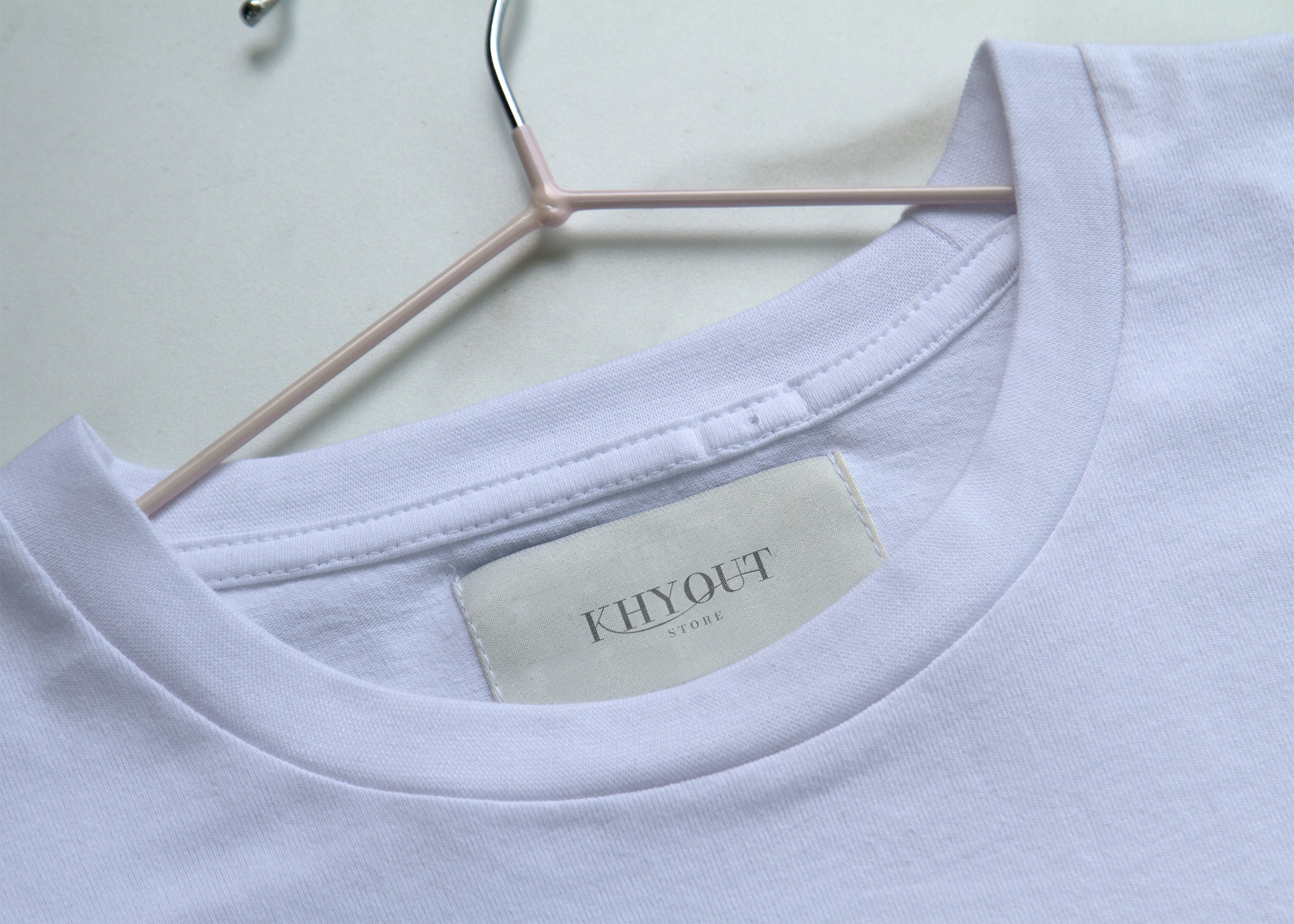
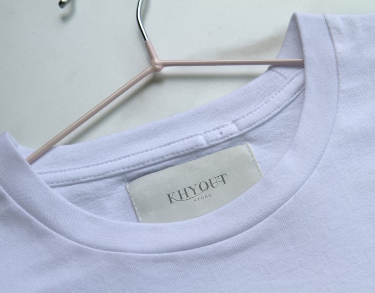
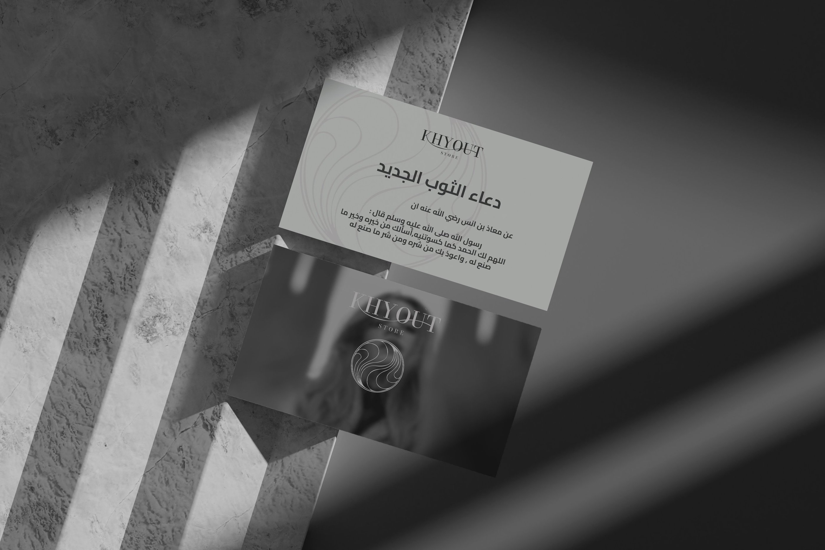
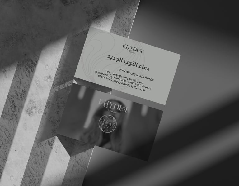
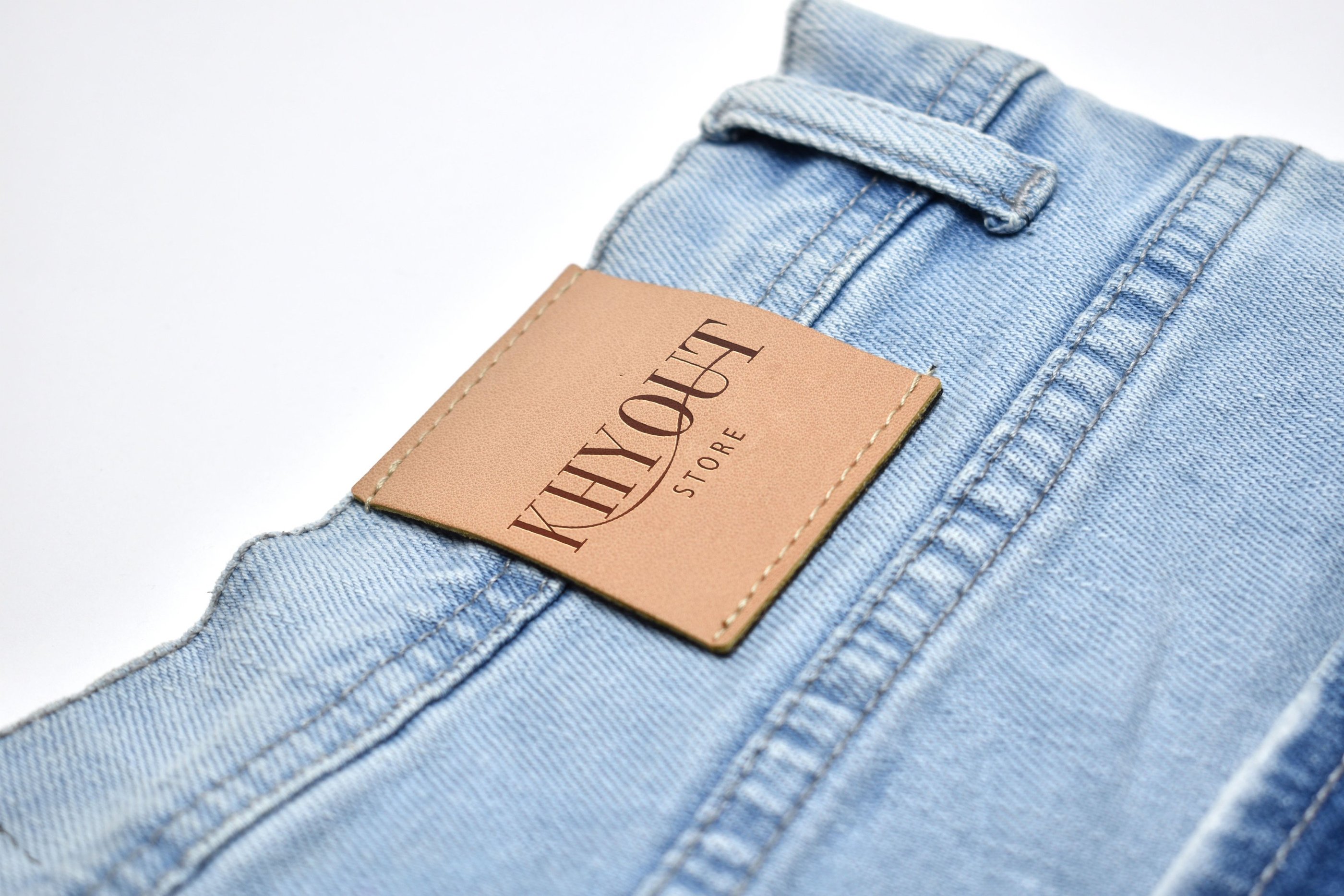
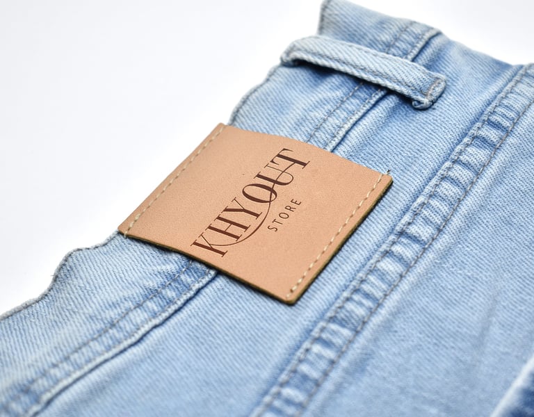
For the branding project "Khyout," I focused on creating a distinctive and memorable visual identity. The key creative feature was the typography, where I designed a custom typeface that included a unique element: a thread that visually connects the letter "K" to the letter "T." This not only symbolizes continuity and connection but also adds a tactile dimension to the design, embodying the essence of the brand. The use of thread represents craftsmanship and attention to detail, aligning perfectly with "Khyout's" values. The overall design strikes a balance between modern aesthetics and timeless elegance, making it versatile for various applications. This thoughtful integration of typography and visual elements ensures that "Khyout" stands out in its market, conveying both creativity and professionalism.
Huthaifa
7/20/2024